Perfect Collection — Art Direction
Clarity on shelf. A cookware identity built to stand out by standing still.
- The brief
- What this had to hold.
- The constraint
- Arabic and English dual-language labels where neither script compromised the information hierarchy.
- The pivot
- Cookware brands sell product features.
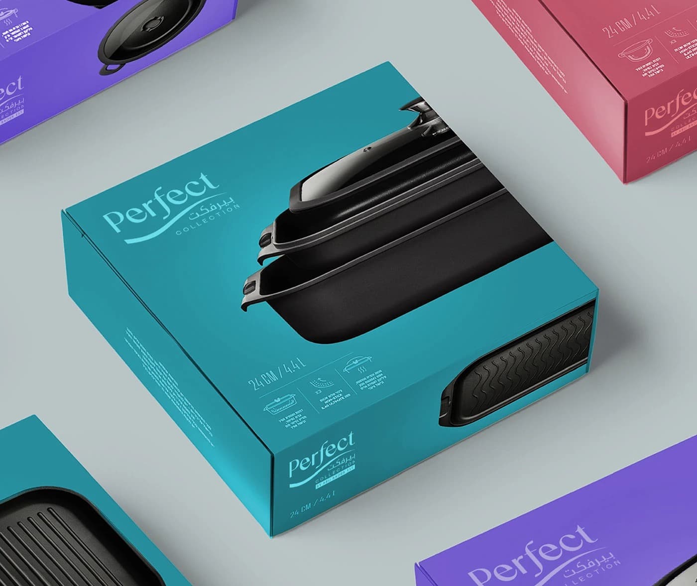
Perfect Collection entered a cookware category that had become visually illiterate — every product on the Saudi and GCC shelf was competing with gradients, drop shadows, and superlatives. The brief was deceptively simple: build a brand that feels premium without the noise.
Cookware brands sell product features.
The right brand sells the cook.
Rollout
SKUs
Product lines
Scripts in parity
Shelf system
The system
- IdentityThe name as the mark.
A logotype built on confident geometric strokes — nothing decorative, nothing soft. Set without irony. The word does the work.
- TypographyBold weight, one hierarchy.
Bold for brand and product names. Regular for volume and specifications. No script, no decorative face — this is a kitchen brand, not a confection.
- ColourWhite anchor. One accent per line.
Matte white as the constant. The accent colour changes per product line but the white field stays fixed — uniformity that lets the product be the hero.
- Photography3D as photography stand-in.
Blender rendering replaced commissioned photography — giving the packaging photographic depth at illustration production cost.
- Label hierarchyThree tiers. Never reversed.
Brand name first, product name second, volume and spec third. A rule that prevented every shortcut that would have buried the brand.
Related work

Like what you see?