
AlRayan Bank — Brand Identity · Campaigns
Forty years of trust, re-set in type.
- The brief
- What this had to hold.
- The constraint
- A bilingual identity with genuine typographic equity — Arabic and Latin at the same optical weight, not a translation that trails behind the primary script.
- The pivot
- The brand didn't need a new story.
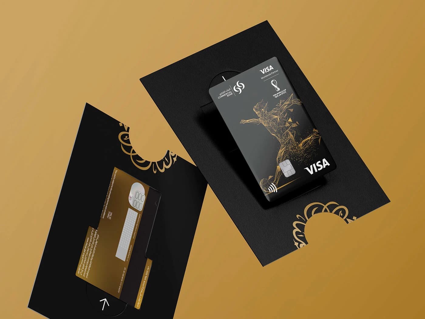
AlRayan Bank came to us with a brand that had done its job — for decades, it stood for stability, compliance, and institutional weight. The brief wasn't to change what the bank stood for. It was to make it look like what it already was.
The brand didn't need a new story.
It needed forty years of the same story, told with more precision.
Rollout
Brand touchpoints
Scripts · 1 voice
Year
The system
- MarkTwo forms. One institution.
The mark is two geometric rectangles — one deeper blue, one lighter — overlapping to form an open aperture. Stability and transparency in a single symbol. Not decorative, not illustrative: a structural statement about what the bank is.
- TypographyArabic and Latin. Equal weight.
Both scripts share the same x-height, stroke weight, and spatial rhythm. The Arabic does not defer to the Latin, and the Latin does not compensate for the Arabic — genuine parity, visible from the card at 85mm to the building face at 10 metres.
- ColourBlue as institutional fact.
Primary corporate blue anchors every surface. A lighter teal provides depth within the mark and enters the system as an accent — on envelope bands, tote blocks, card highlights. White dominates, ensuring the brand reads as open rather than heavy.
- GridOne system. All scales.
The horizontal blue band at the base of all collateral is not decorative — it is the system's floor. From stationery to merchandise, it makes every surface unmistakably AlRayan. The proportional logic that governs it holds unchanged from letterhead to building signage.
Related work
Like what you see?