Commercial Bank of Qatar — Identity & Launch
A credit card built for a country hosting the world.
- The brief
- What this had to hold.
- The constraint
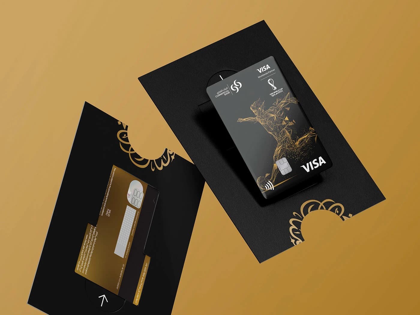
- A co-branded lockup with FIFA's official partner mark, where neither brand was allowed to dominate the other.
- The pivot
- A card is usually a banking product.
CBQ came to us nine months before FIFA World Cup 2022 — not with a campaign brief, but with a product. A limited-edition payment card tied to the most-watched sporting event in history, issued to priority customers and the arriving global traveler.
A card is usually a banking product.
For this launch, it had to feel like a cultural artifact.
Rollout
Branches
Airport activations
Broadcast cuts
Scripts · 1 voice
The system
- Mark treatmentCo-primary. 1:1. No hierarchy.
Both marks sit at equal optical weight. A 1-pixel rule between them becomes the third brand element — not a divider, a hinge. Neither logo surrenders hierarchy at any scale, from embossed chip to 48-sheet.
- TypographyTwo scripts, one voice.
Neue Haas Grotesk + 29LT Zarid Sans. Matched x-heights and optical weights.
- ColourGold as accent, never field.
CBQ navy as anchor, field color, and voice. FIFA gold capped at 8% usage — applied to the chip, the rule, the callout. The constraint kept the card from reading as commemorative coinage.
- Motion principleMove like a pass.
Every transition runs on the rhythm of a ball pass: 240ms in, 340ms out. Named the "pass curve" in the system documentation so the in-house team could extend it after we handed off.
- GridNon-negotiable breathing room.
A 12-column grid with a 4mm horizontal inset reserved for bilingual parity. Removed the temptation to squeeze Arabic to fit English — the single most frequent failure of bilingual banking collateral in the region.
Related work

Like what you see?